
Matching the Coat to the Bag
Playful, Joyful, Tonal Minimalism makes a Nostalgic Splash
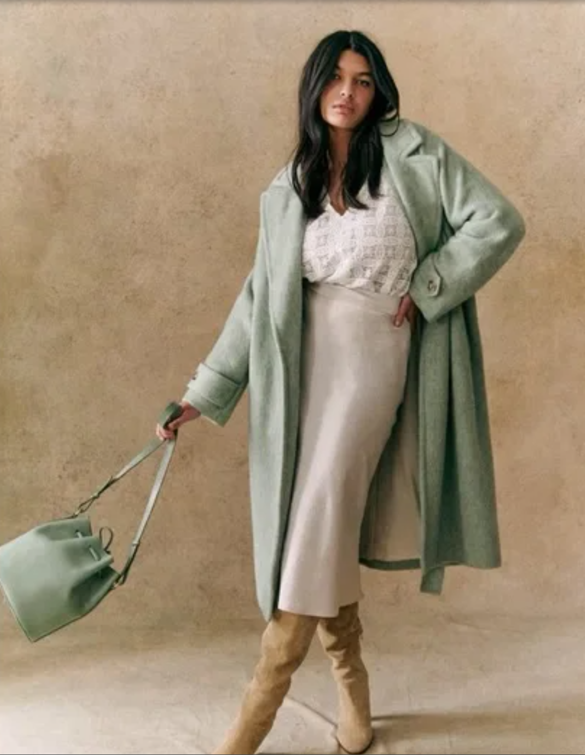
The coordinated coat and bag as a complete statement — quiet luxury 2.0 in full colour. / @sezane in IG
Previously pedantically preppy, this vibe of flawless, considered coordination of the 2010s eventually gave way to the greige-and-tan uniformity of quiet luxury. The aesthetic that weakly whispers. In this greyscale world, it's best not to look like you tried. Nothing too bold. Nothing too colourful or flashy. In light of minimalism's cold claws sunk deep into the collective fashion psyche for the last decade plus, a little colour coordination returning becomes a breath of air to otherwise deprived lungs. Despite the injection of colour, the trend reads as sharp and intentional, a subtle wink in minimalist social feeds and mood boards. It's Quiet Luxury 2.0 - allowing aesthetic ascetics some colour play performed with control and restraint.
Why Matching Feels Fresh Now
Let's be so for real. Our feeds are insanely chaotic right now. Trying to keep up with each cascade of new seasonal collections and brand launches is daunting. A bit of coordination goes a long way when everything else is so overwhelming, both in life and in the fashion world.
The calm, deliberate pairings stop scrolling thumbs and are therapeutic to look at. Brighter colors can be pleasantly refreshing in this context, after nearly a decade-long parade of neutrals. We are all craving order, as well as a visual vacation from beige.
Minimalism 2.0: Colour Inside the Lines
Tonal minimalism can be a ‘safer’ way to play with bolder shades. it creates a safety net for experimentation, especially when tailoring is sleek, defined, and structured. The unbroken lines and implied shapes created when the bag and coat match allow for an uninterrupted silhouette, adding an elegance and grace you’d otherwise miss when the bag’s contrast visually disrupts the lines of the outerwear.
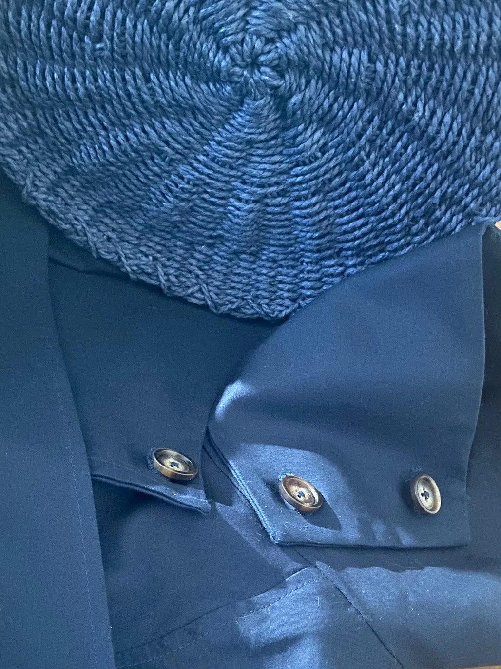
The tension between materials is what makes tonal dressing interesting — same colour, entirely different hand. / @studiogliss
Nostalgia, Aspiration, and Class Signalling
The colour matching element evokes a time of editorial. Gloss, when you’d see the looks flipping through magazine pages or passing through department store displays instead of from the screen of your phone. The coordination aspect begs to be seen, but isn’t particularly flashy.
In economically and otherwise volatile times, this level of polish feels subtly aspirational, reading as luxury without screaming. The coordinated coat-bag pairing resolves the tension between quiet luxury aesthetic fatigue and the desire to signal status.
For Gen Z, ever the unafraid to play with colour, this trend will likely be translated into either a) pushing the colour envelope with ever brighter and contrasting ensembles [photo] or b) playing with fun Y2K and vintage- sourced shapes and cuts. Experimental designs tempered with coordinating colour is a means of expressing joy and creativity. Gen Z loves to wear what feels good, but they’re also maturing. This trend is the perfect challenge to their rebellious and honest pursuit of self-expression, without the need to go completely off the rails with the colour.
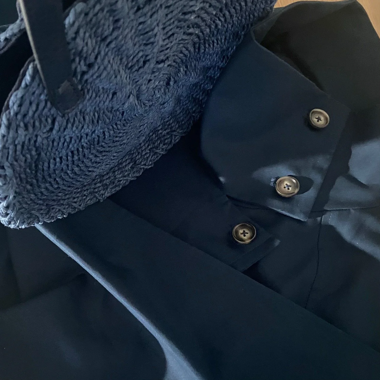
Coordination without matching exactly — structure and weave in the same deep navy, reading as intentional rather than accidental / @studiogliss
Social Media and the Power of the Pinned Fit
Coordinated looks just work because our eyes are naturally drawn to repeating visual elements, and the colour-blocking and symmetry achieved in these looks satisfy an itch many of us have for balance and order. At the same time, the look scratches an itch for more colour and expression. It’s a perfectly balanced and utterly satisfying thing to look at. Naturally, it will be saved, screenshotted, pinned, and emulated. It will definitely stop a scroll if done correctly.
The considered detail — coat meets bag, colour meets texture, intention meets restraint / @studiogliss
How to Wear Without Looking Dated, Stuffy, or Stiff
The secret to making this trend feel considered rather than cosplay is restraint within the colour play itself. Limit the palette to two colour families for the entire outfit — this creates intentional contrast without tipping into chaos. A neutral base lets the coat and bag do the talking, which is exactly where the statement belongs.
Proportion matters as much as colour. For the pairing to land with real impact, the coat and bag need to be the defining elements of the look — which means both deserve structural consideration. Reach for oversized and boxy cropped cuts, capes, or anything with a strong silhouette. The bag should match that energy — ultra angular or gloriously slouchy, but never a simple cross-body. Without structure, a colour-matched bag disappears into the coat rather than completing it. Ultra-wide shapes like the baguette clutch are particularly strong here, creating a satisfying visual echo across the body. ⁘
When an exact colour match proves elusive — and it often does — go tonal instead. A bag several shades lighter or deeper within the same colour family creates a layered, sophisticated effect that can actually read more intentional than a perfect match. It also allows the bag to assert itself rather than simply blend in.
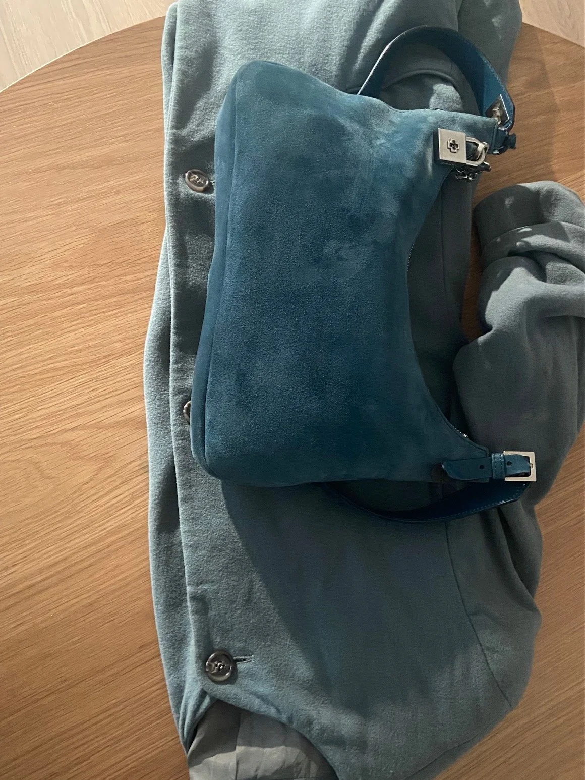
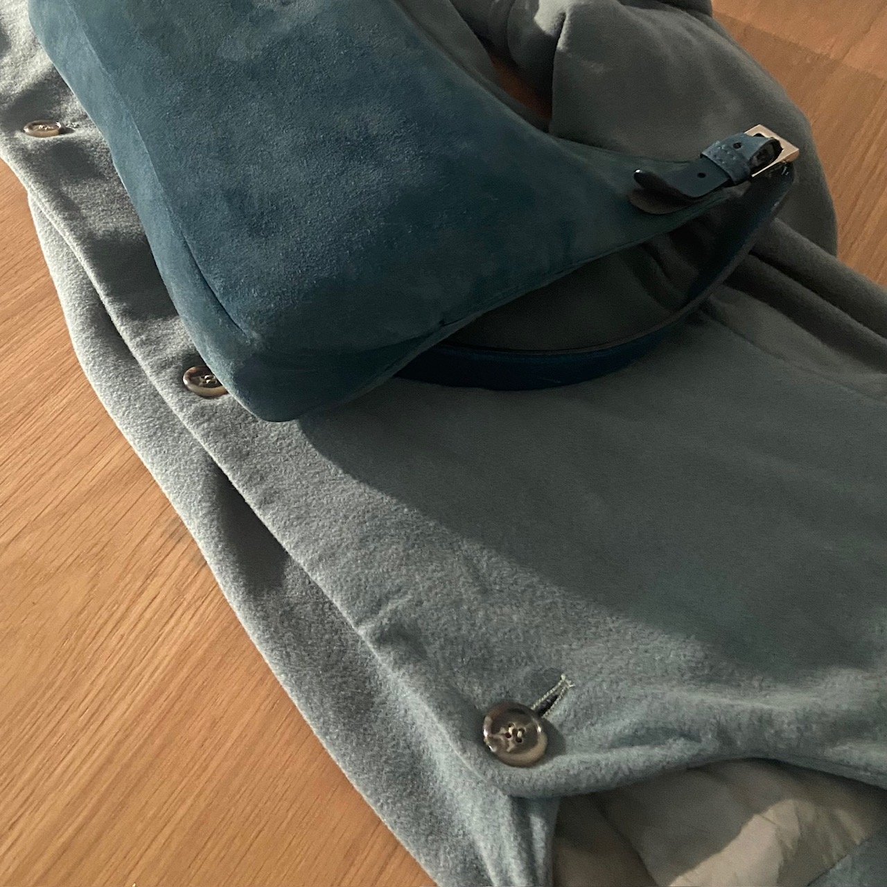
When the match isn't exact, go tonal — a bag several shades deeper in the same colour family reads more intentional than a perfect match / @studiogliss
How to Wear Without Looking Dated, Stuffy or Stiff
The secret to making this trend feel considered rather than cosplay is restraint within the colour play itself. Limit the palette to two colour families for the entire outfit — this creates intentional contrast without tipping into chaos. A neutral base lets the coat and bag do the talking, which is exactly where the statement belongs.
Proportion matters as much as colour. For the pairing to land with real impact, the coat and bag need to be the defining elements of the look — which means both deserve structural consideration. Reach for oversized and boxy cropped cuts, capes, or anything with a strong silhouette. The bag should match that energy — ultra angular or gloriously slouchy, but never a simple cross-body. Without structure, a colour-matched bag disappears into the coat rather than completing it. Ultra-wide shapes like the baguette clutch are particularly strong here, creating a satisfying visual echo across the body. ⁘
When an exact colour match proves elusive — and it often does — go tonal instead. A bag several shades lighter or deeper within the same colour family creates a layered, sophisticated effect that can actually read more intentional than a perfect match. It also allows the bag to assert itself rather than simply blend in.
Reclaiming Visible Effort
The pendulum is swinging from effortless to I cared enough to make this coordinate — and it's a quiet declaration to reclaim taste in a more joyful way. The matching of the bag to the coat is the anti-trend we all need for 2026; fun without abandoning restraint. We could call it ‘tonal minimalism’ for those who are more conservative dressers.
What it really is, though, is permission. Permission to be seen trying. Permission to find pleasure in the considered detail — the coat that meets the bag that meets the moment. After years of performing nonchalance, a little visible effort feels quietly ... radical. ⁘
For more takes on fashion, beauty, and the cultural moments shaping luxury brand narrative ↓
Curious about your own brand's narrative spine? Your complimentary Brand Archetype is waiting. ↓